

Our creative award-winning copy, content and custom experiential marketing campaign events, engaging conferences, collaborative trade fairs and popular entertainment shows have garnered rave reviews. Like a perfectly timed performance, we adjust the lights, the sound and screen and take sound check seriously to keep our two-decade+ reputation of excellence. Our design teams help us create impact for brand visuals. Our stage is set to reflect the best talent and we let the press know that we are proud of who we represent.
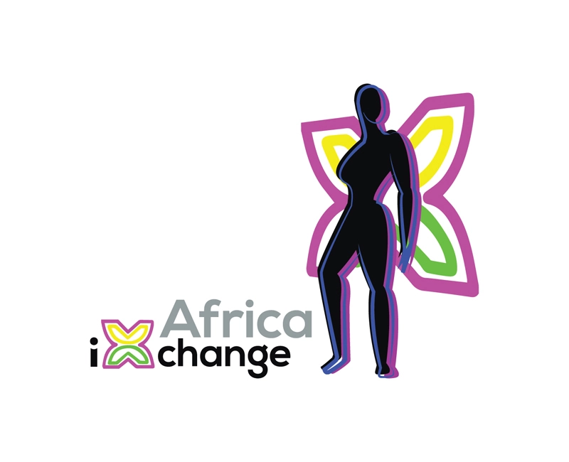
We started with an idea that if neighbors break bread together there will be a path to greater solutions. We invited strong, powerful women from across various parts of Africa to sit and discuss how financial empowerment options would benefit their communities. Our event team built collaboration between businesses, leadership and nonprofit organizations. Our designers came up with the perfect logo resembling the written script of several languages of Africa, and embodied the spirit of the strong women with wings in the color of various flags.
After extensive strategy meetings, our designers used the circle, the most commonly used shape in weddings around the world. If you look carefully at the logo, the four leaves form a ring. Every culture has a candle or light as a significant feature so to top off each leaf, we added the yellow shape of a flame. From afar, the design resembles henna, another frequently used motive. The client loved this design so much because we incorporated what she liked and where she aspired for her company to go in the future. “Can I use this for all parts of my brand?” Of course! Branding is more than a logo, but a good logo easily encapsulates what you do and what you want to represent!
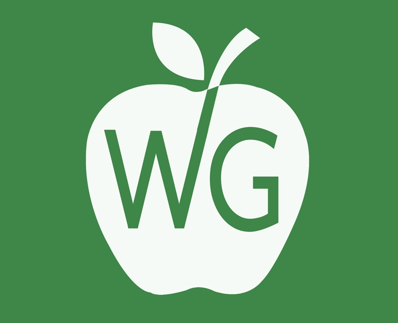
Niching down client strengths by paring design elements is part of our system and it was a huge hit for this provider of education services for school employees. Together, we chose a green apple that rests in a square with rounded corners, similar to how an app looks on a phone. The client’s response to seeing her finished logo was, “It is awesome! Clean, simple and dynamic. I actually love the green color and the font is perfect. Thanks so much for giving my company an identity!” The logo was just part of the process to take this brand from just an idea to a multi-level firm.
The founders of a private school wanted to ensure that their unique element, their value based educational system was included in design. We used the most iconic symbol of Christianity, the cross, as the base and added to it, books as the leaves of the tree, growing and spreading out in every direction. We created other social media assets in the same bright primary yellow to give the brand a uniform look.
Editors make decisions to “cut hard” and streamline multiple ideas so that only the plausible ones remain. The mission of this brand was to provide skills and education options to high school students who need alternatives to an expensive college education. Rather than chase every idea and cloud vision, we simplified the strategy and design of this brand. We used the dollar sign as a ladder to match this client’s idea that it takes multiple steps to financial growth.
Talent showcase on an international platform started as a multi-city tour and extended to playing The Masters. Garnering good will and press was just the start of what is now a strong brand.
Entertainment company that expanded from small one-person shows to multi-city productions and films. We helped build the vision, built the production team, bring in the crew and kept all the pieces moving towards a single strategy – grow global.